Development
Urban Outfitters Responsive
Prior to the responsive launch, Urban Outfitters maintained two sites: one for mobile; one for desktop. This was not only difficult to maintain, but also didn't make sense for customers. Most traffic was coming from phones and the mobile experience was sub-par compared to the desktop version. We restructured the site using Foundation and worked closely with design and UX teams to ensure everything looked great, no matter the screen size.
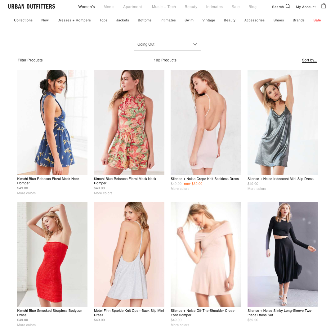
A screenshot of the Urban Outfitters category page.
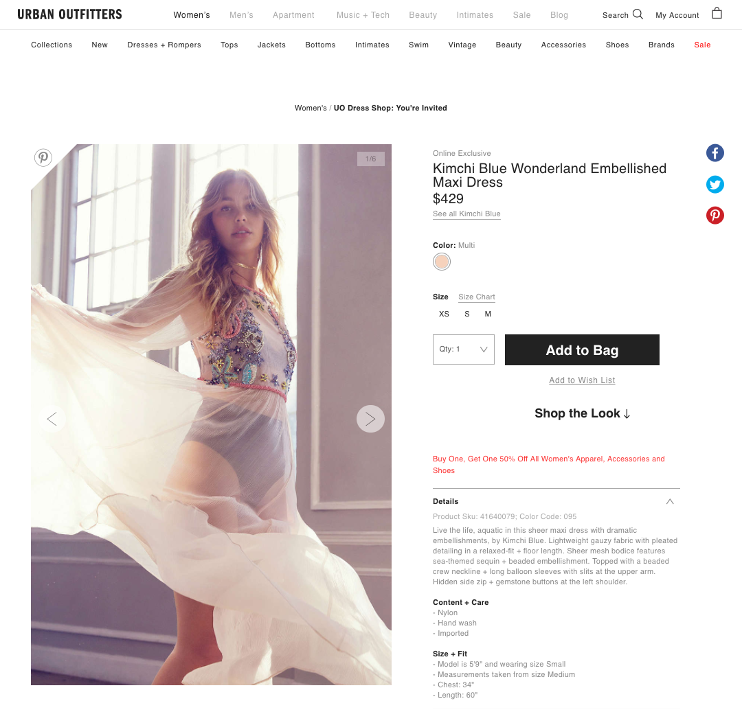
A screenshot of the Urban Outfitters product detail feature.